Bright Path Paediatric Therapy
A joyful, family-first brand for a paediatric OT practice
The Client
Business Name: Bright Path Paediatric Therapy
Industry: Paediatric Therapy & Occupational Therapy
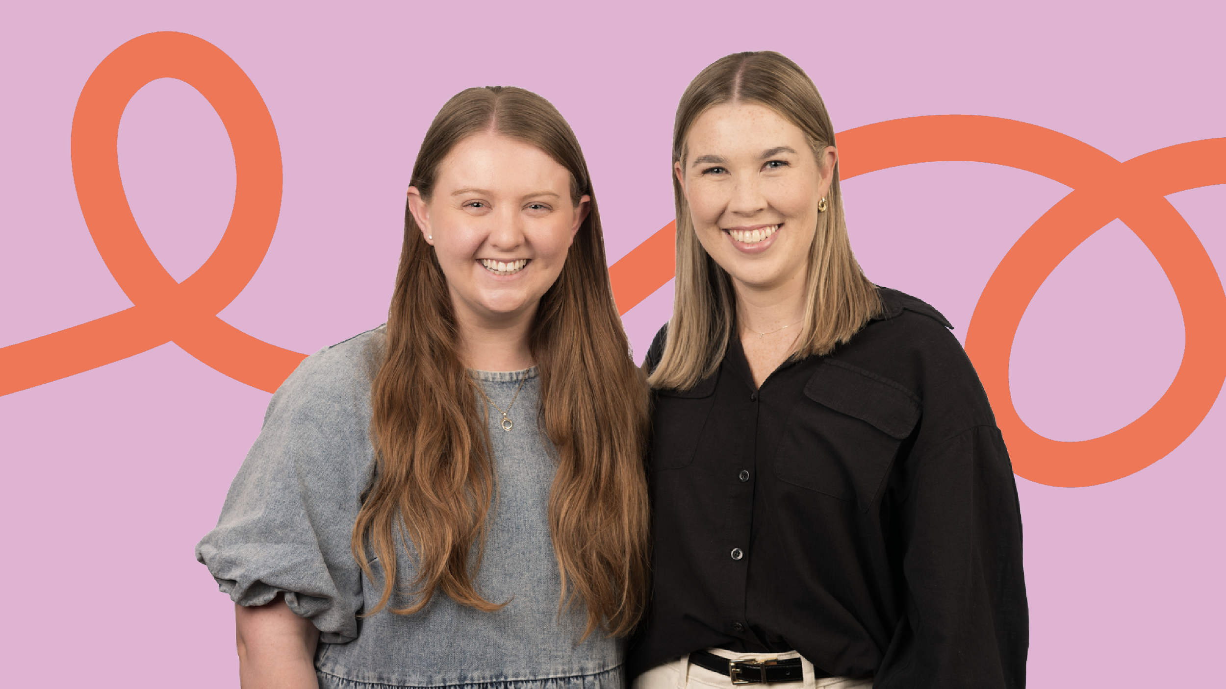
Bright Path Paediatric Therapy is a mobile paediatric OT practice supporting children and families across Brisbane, Australia. Founded by paediatric occupational therapists Emma Wilson and Emily Tupper, Bright Path brings evidence-based therapy directly into children’s everyday worlds – at home, at school, and out in the community.
Their approach is warm, flexible, and deeply family-centred. No long waitlists. No stuffy clinic rooms. Just practical, meaningful support that helps children build confidence, independence, and life skills – one step at a time.
The Brief
Objectives:
Emma and Emily wanted a brand that felt friendly and child-positive without tipping into anything too child-ish. It needed to instantly put parents at ease, feel engaging for children, and still look credible to schools, GPs, and other professionals.
Just as importantly, the brand needed to reflect how Bright Path actually works: flexible, family-centred, and grounded in real life. Something warm and modern that would grow with the practice and feel just as right now as it will in years to come.
Scope:
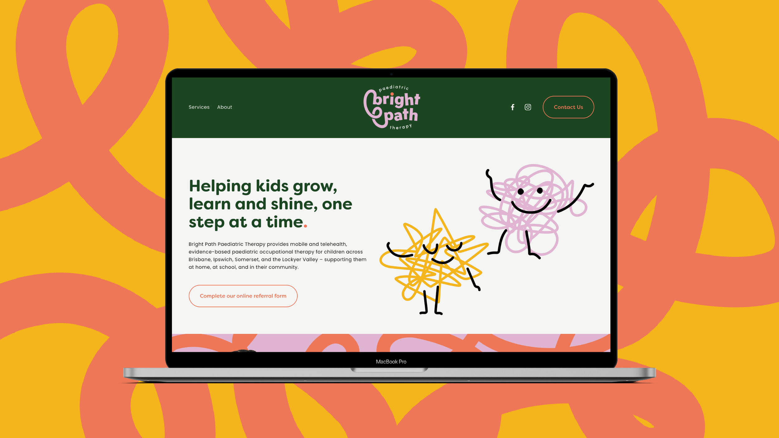
This project combined a Brand in a Day and Website in a Week, giving Bright Path a complete, cohesive brand and website in a short, focused timeframe.
The result was a strong, consistent brand brought to life across both visual identity and website, ready to support Bright Path from day one.
The Challenge
Paediatric therapy branding often sits at two extremes – overly clinical on one end, or overly playful on the other.
Bright Path needed to find the sweet spot in between. The brand had to feel joyful and approachable, but also calm, capable, and trustworthy. It needed to speak to parents first and foremost, while still feeling welcoming and positive for children.
The Process
Discovery
We started by getting clear on Emma and Emily’s values, how they work with families, and what they wanted Bright Path to stand for. Words like belonging, progress and partnership, came up again and again.
The idea of a “bright path” – something you walk together, step by step – naturally became the heart of the brand.
Concept Development
The concept came to life through soft curves, flowing lines, and gentle movement. These elements represent growth, progress, and the reality that development isn’t always linear – and that’s okay.
Design Refinement
We refined the identity to ensure it worked seamlessly across the website, social media, and future materials. The visual system needed to feel flexible – calm and reassuring in some moments, brighter and more celebratory in others.
The Solution
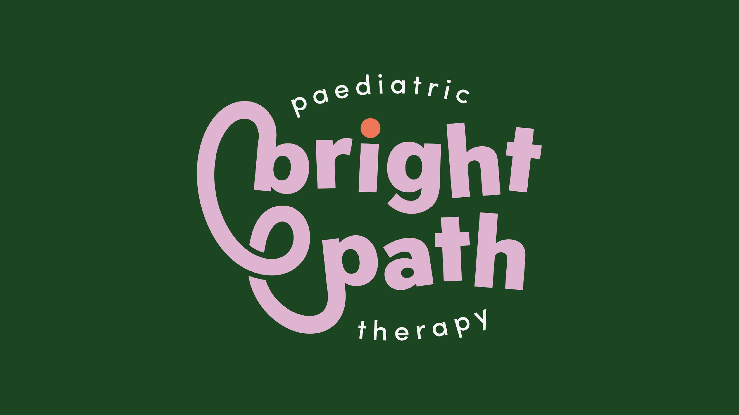
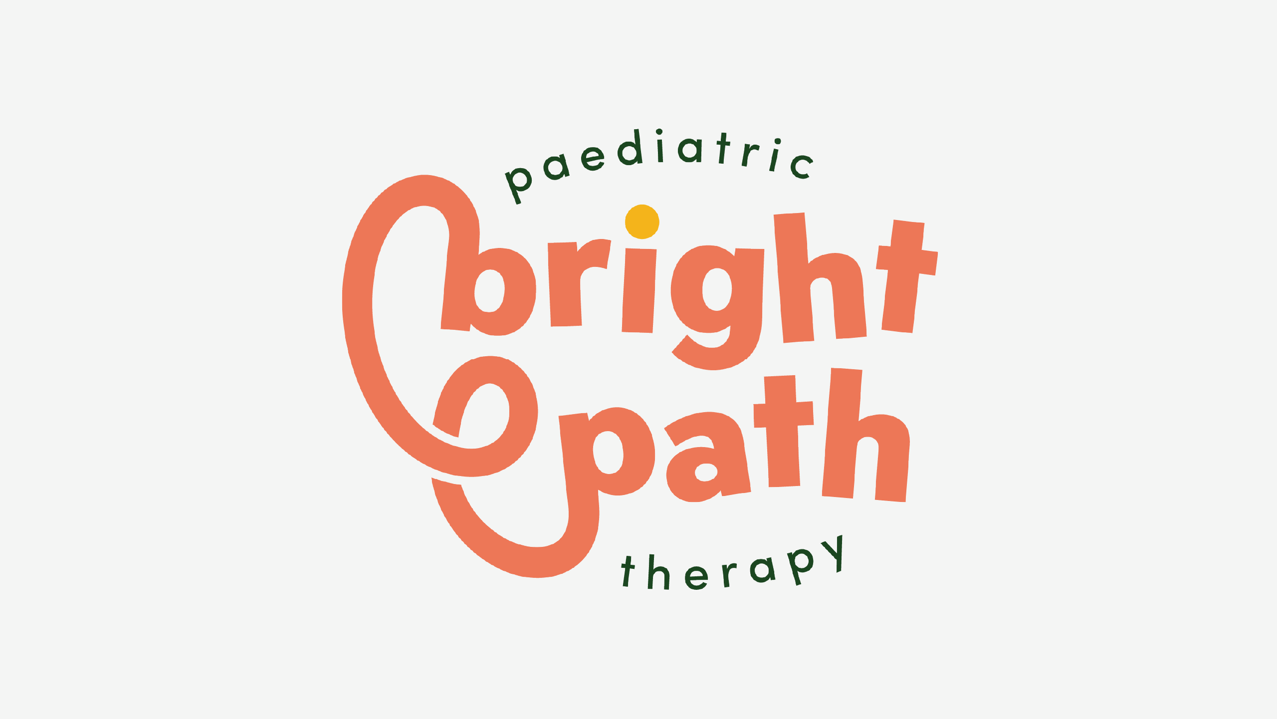
Logo Design
We created a friendly, modern logo with rounded letterforms and soft curves, designed to feel optimistic, approachable, and full of warmth. The logo reflects movement and progress, reinforcing the idea that growth happens over time, one step at a time.
Colour Palette
The colour palette balances calm with joy. Softer, natural tones create a sense of safety and trust for families, while brighter accent colours bring energy, celebration, and optimism. Together, they allow the brand to feel reassuring when it needs to be, and playful when it wants to celebrate progress.
Typography
Clean, rounded typography was chosen to feel accessible and family-friendly, while still being professional and easy to read across digital platforms.
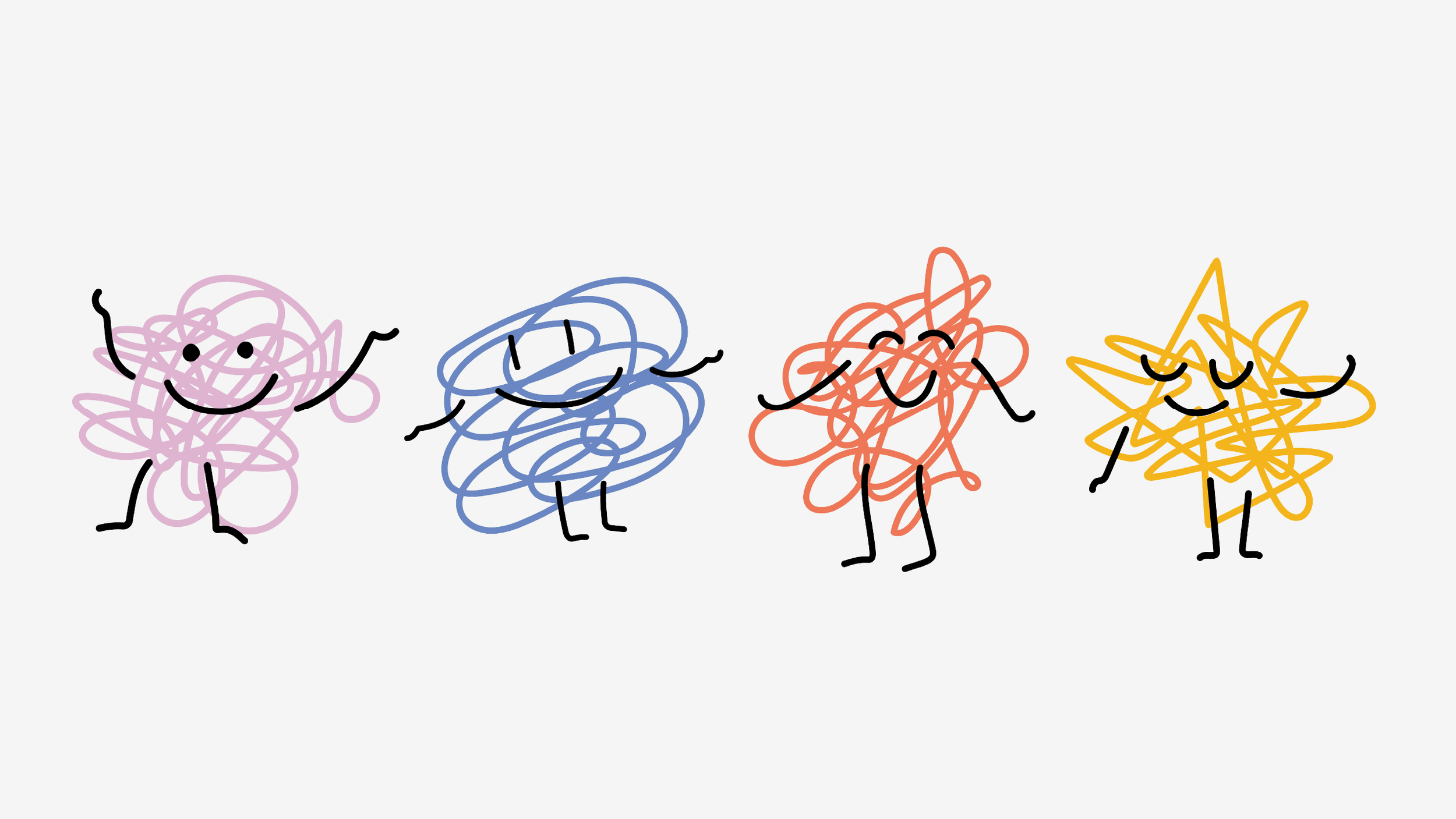
Characters & Visual System
To bring the brand to life, we designed four playful, squiggly characters that run throughout the visual identity. These characters are more than decorative – they represent a path or journey, with each one taking a slightly different shape and direction.
Just like every child’s journey, no two paths are the same. The squiggles reflect progress, movement, and individuality, reinforcing the idea that development isn’t linear, and that’s completely okay. Together, they add personality, warmth, and flexibility to the brand, helping it feel approachable, child-positive, and full of character.
Visual Identity
The wider visual language brings together curved lines, gentle shapes, and moments of playful movement. Everything works together to create a brand that feels supportive, joyful, and human, a visual reminder that Bright Path walks alongside families, wherever their journey leads.
The Impact
Warm and Reassuring
Parents feel supported and confident. Children feel comfortable and welcomed. Referrers feel assured they’re recommending a trusted service.
Clear and Distinct
Bright Path now stands apart visually, with a brand that feels modern, optimistic, and genuinely human.
Built to Grow
The identity is flexible and future-proof, ready to support the practice as it grows across regions, services, and platforms.
“Beth captured exactly what we wanted Bright Path to feel like. The brand is warm, playful and professional, and truly reflects how we work with children and families. The process was collaborative, fun, and incredibly thoughtful.”
– Emma Wilson & Emily Tupper, Bright Path Paediatric Therapy
The Website: www.bpptherapy.com.au
If your business is ready for a brand identity that combines clarity, confidence, and creativity, we’d love to help. Drop me a message or book a Discovery Call to start your brand journey today!