Sharpe Architecture
Brand identity and website for a sustainable residential architecture practice
The Client
Client: Sharpe Architecture
Industry: Sustainable residential architecture
Sharpe Architecture is a residential architecture practice focused on designing thoughtful, sustainable homes that respond to their environment and the way people live. Their work is rooted in clarity, longevity and care, but their existing brand and website no longer reflected the quality or values of the practice.
They approached us to create a brand identity and website that felt calm, contemporary and considered, without leaning into hight luxe or corporate aesthetics. The aim was to communicate credibility, environmental awareness and approachability, while letting the architecture speak for itself.
The Brief
Sharpe Architecture needed a brand identity and website that aligned with how they work and what they value.
Objectives:
Reflect a sustainable, environmentally conscious approach to residential architecture
Communicate professionalism and expertise without feeling intimidating
Create a clear, cohesive visual identity across brand and digital
Design a website that showcases projects clearly and supports future growth
Scope:
Logo design
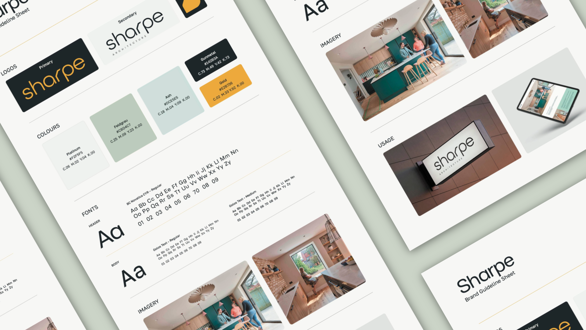
Colour palette and typography
Brand guidelines
Website design and build
The Challenge
The main challenge was balance. The brand needed to feel credible and assured, while remaining warm and accessible for residential clients. It also needed to reference architectural precision without relying on obvious or overused visual cues.
The website needed to feel structured and easy to navigate, while allowing imagery and content to breathe. Nothing could feel forced or overly styled.
The Process
We began with a strategic phase, exploring Sharpe’s values, approach and long-term vision. From there, we defined a clear direction focused on structure, restraint and warmth.
Design decisions were made carefully, with an emphasis on fundamentals rather than decoration. The brand and website were developed in parallel to ensure everything worked as a cohesive system.
The Solution
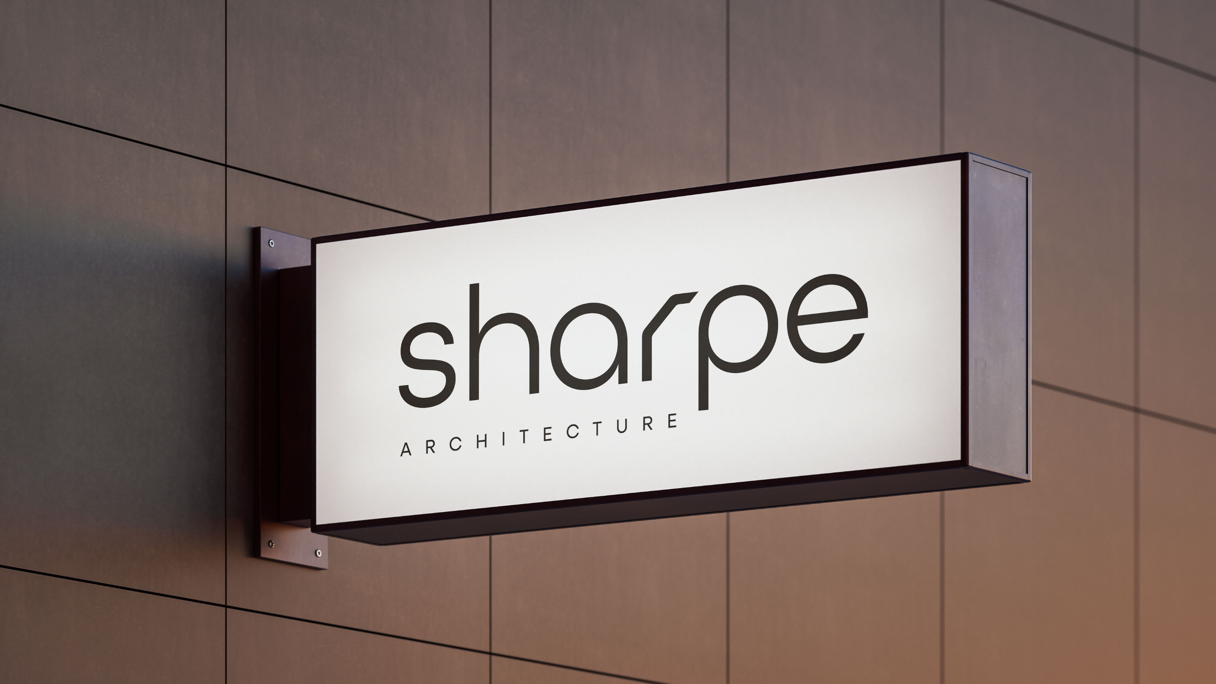
Brand Identity
The logo is clean, modern and understated. Rounded letterforms introduce warmth, while a subtle structural detail within the “r” references architectural precision in a refined way. It is a detail that reveals itself over time rather than demanding attention.
The colour palette combines soft neutrals with deeper grounding tones, referencing natural materials and the built environment. Typography is contemporary and highly legible, supporting clarity across both print and digital applications.
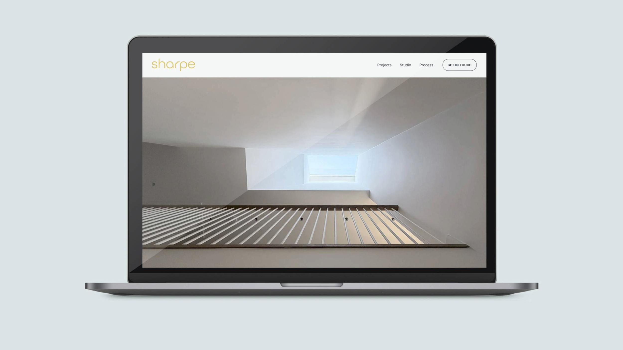
Website Design
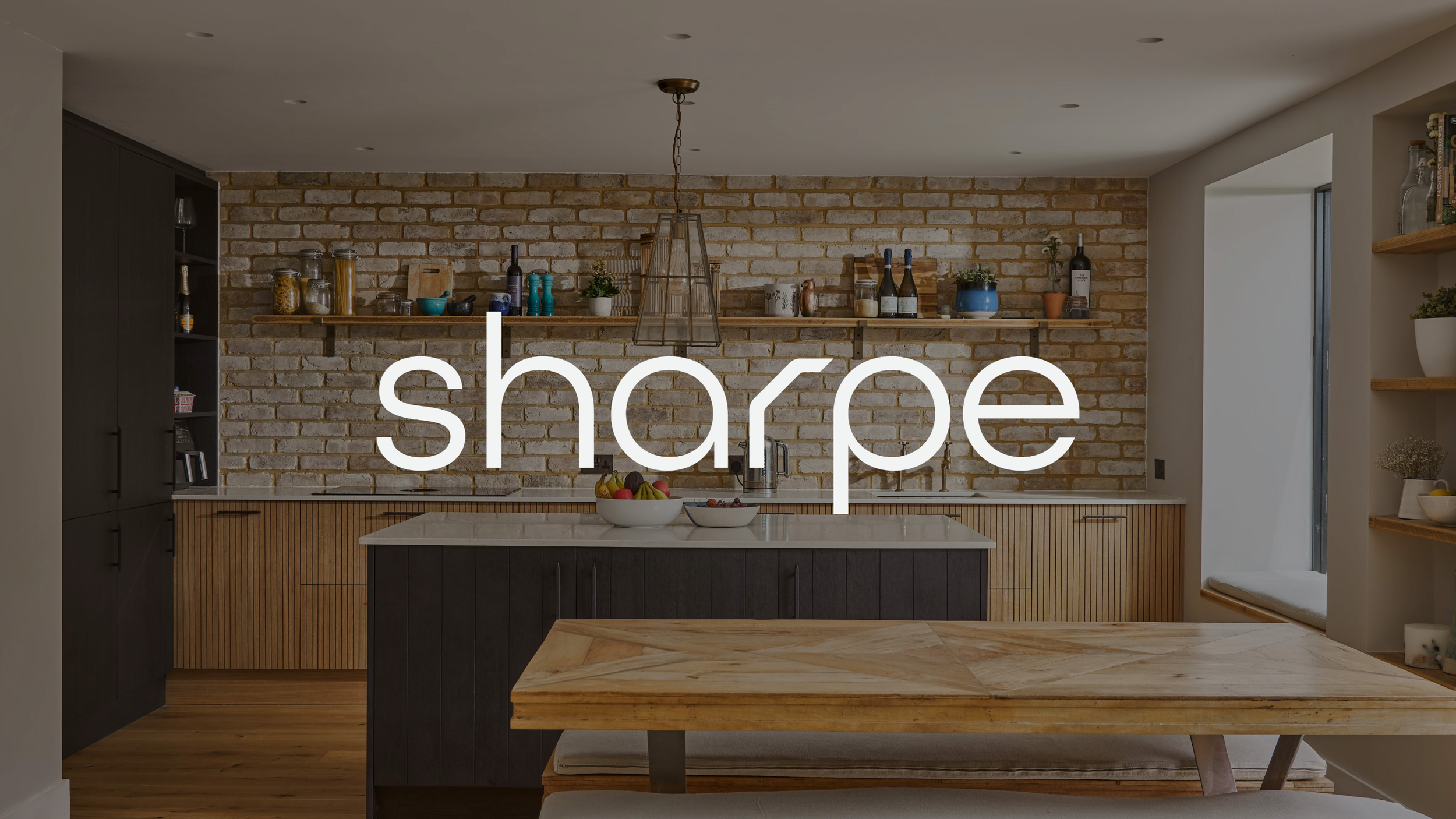
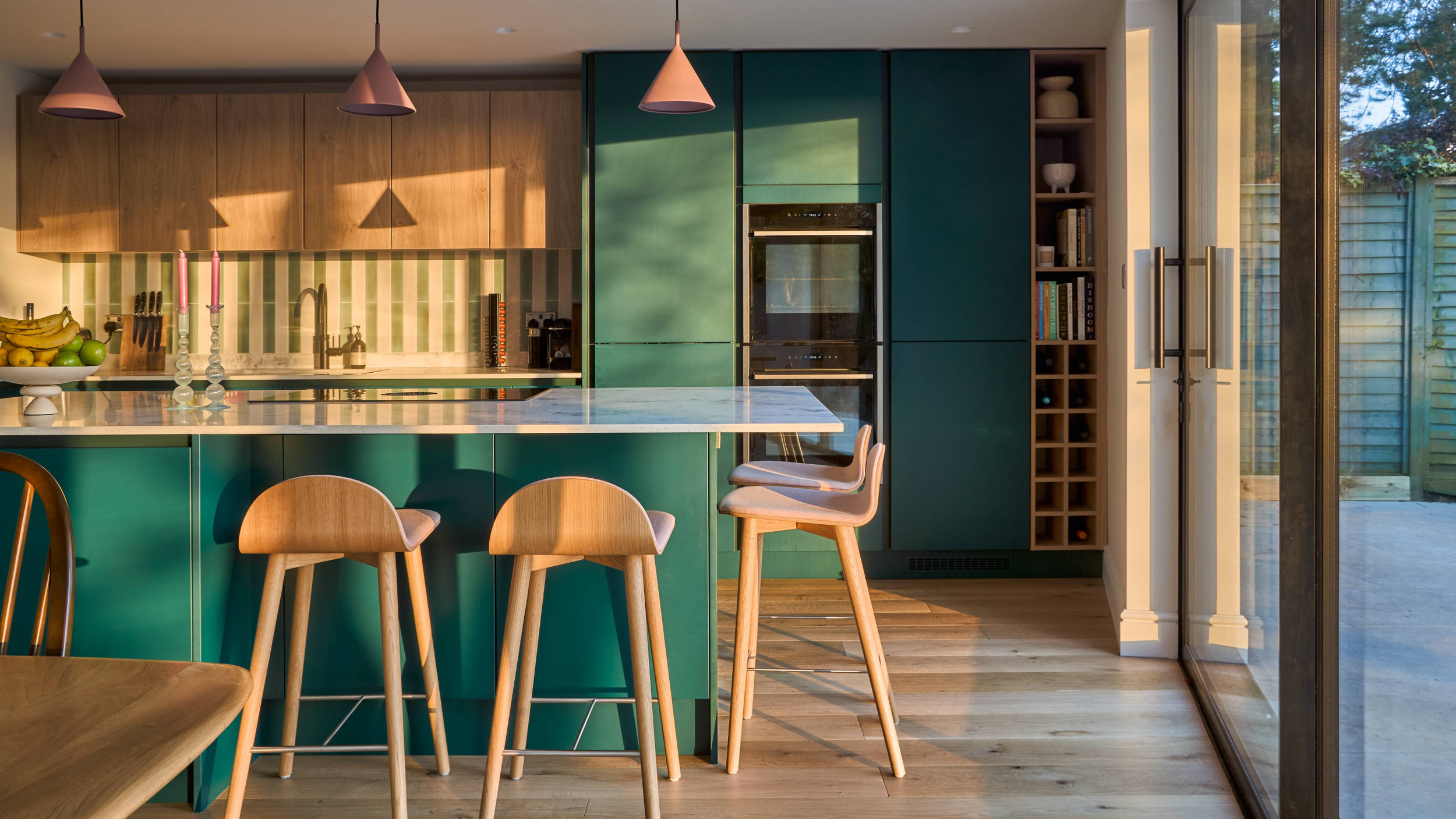
The website was designed to be calm, clear and intuitive. A simple structure guides visitors through the practice, their work and their approach, while generous spacing and considered typography allow projects to take centre stage.
The Impact
Sharpe Architecture now has a cohesive brand and website that accurately reflect the practice and their values.
A clear and confident visual identity aligned with sustainability and longevity
A website that supports understanding, trust and engagement
A strong foundation for future growth and marketing activity
The result is a brand presence that feels considered, professional and true to the way Sharpe Architecture works.
Website: www.sharpearchitecture.co.uk
If your business is ready for a brand identity that combines clarity, confidence, and creativity, we’d love to help. Drop me a message or book a Discovery Call to start your brand journey today!