F12 Consult
A telematics brand that’s precise, intelligent, and trusted
The Client
Business Name: F12 Consult
Industry: Telematics & Technology Consultancy
F12 Consult delivers fault-tolerant, scalable telematics software solutions for growth-driven businesses. With a mission to revolutionise how telematics is used, F12 makes complex systems simple, empowering clients to reduce costs, increase efficiency, and mitigate risk. Their values are built around trust, integrity, and innovation, with a brand personality that’s friendly, geeky, and deeply invested in client success.


The Brief
Objectives:
The goal was to create a bold, professional brand identity that could grow with the business and resonate with its core audience of agencies, startups, and mid-sized companies across Europe. The identity needed to convey both technical excellence and a personable, human approach, positioning F12 as a trustworthy, intelligent partner in a competitive telematics landscape.
Scope:
The brand identity work included:
A master logo and secondary lockups
Colour palette and typography system
Iconography and graphic language
Layout styles for digital and print applications
Brand tone of voice and personality expression

The Challenge
F12 needed a distinct identity that could hold its own in a highly technical and competitive market. The brand had to strike a fine balance: projecting authority and reliability while still reflecting the team’s down-to-earth, personable nature. The design system needed to communicate data intelligence, speed, and simplicity, without becoming cold or overly complex.
The Process
Discovery Phase:
We began by unpacking the F12 mission, values, and archetypes – the Sage and the Ruler – identifying key traits like intelligence, clarity, innovation, and leadership. The client’s “decent chaps who care” attitude became central to the tone of voice and visual design.
Concept Development:
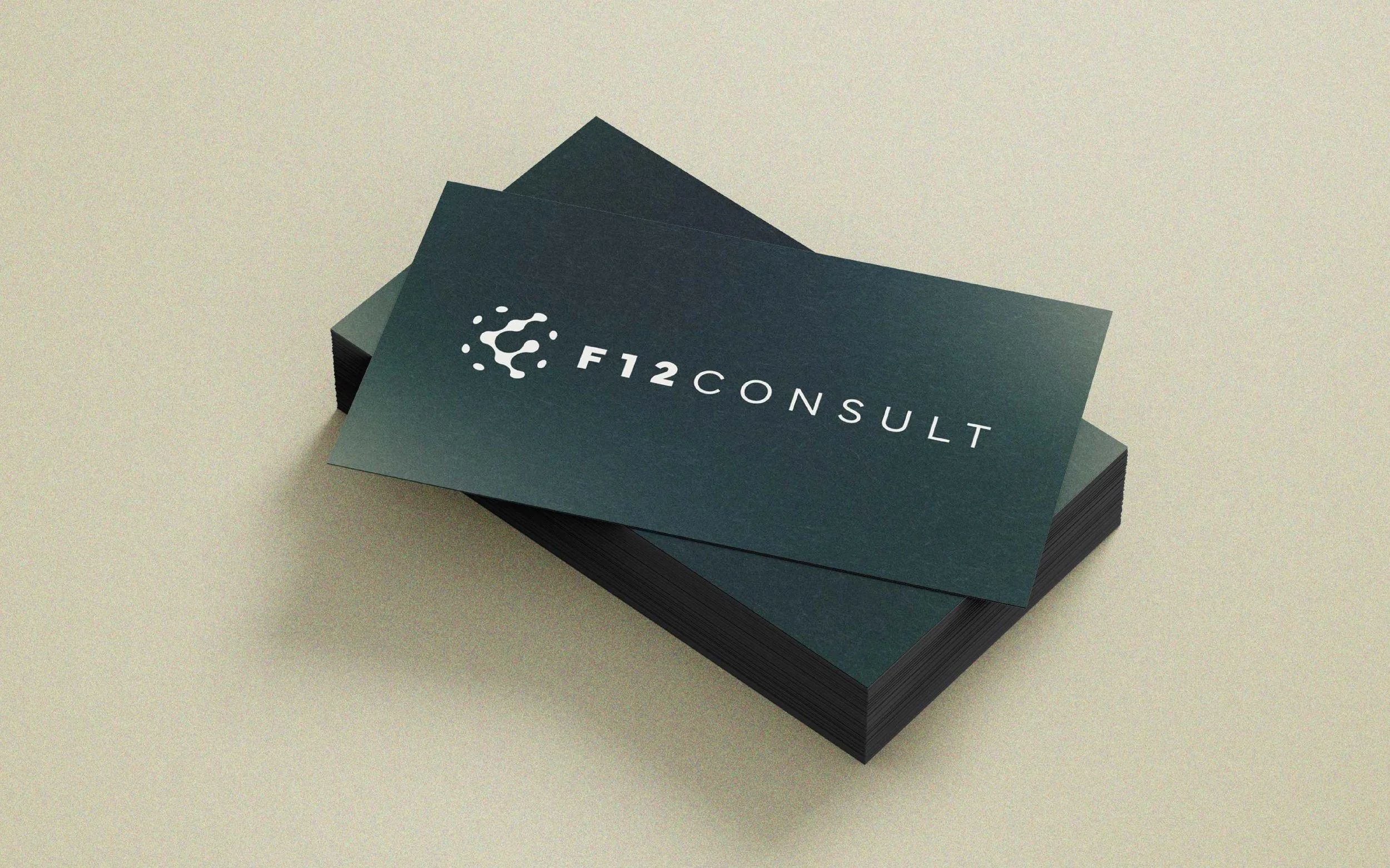
Inspired by F12’s name and global ambitions, we designed a logo made from 12 circles, six of which form an abstract “F.” This circular motif symbolises worldwide reach, the flow of data, and precision. The colour palette was chosen to blend the reliable with the energetic, Sage and Compass for trust and clarity, with Velocity orange adding a jolt of innovation and forward movement.
Typography choices emphasised clarity and confidence, and gradients and granular textures express motion and data connectivity, used in everything from hero sections to subtle background imagery. Every element was designed to be modular, clean, and scalable.
The Solution
Logo Design:
A dynamic, globe-inspired “F” created from 12 interconnected circles, symbolising global reach, movement, and precision.
Colour Palette:
F12’s colours strike a balance between trust and innovation. A deep green communicates reliability and intelligence, while a soft grey-beige adds clarity and professionalism. A bold burnt orange brings energy and forward momentum, and a light ivory provides space and readability. Together, they reflect F12’s focus on precision, trust, and progress.
Typography:
Nimbus Sans Extd – for strong, structured headers
Neulis Sans – clean, legible body text
IBM Plex Mono – for tech/data moments and callouts
Visual Identity:
Soft mesh gradients, granular overlays, and circular iconography communicate data flow, connectivity, and digital agility. Paired with a clear, supportive tone of voice, F12’s identity feels professional yet approachable.
The Impact
Stronger Brand Recognition:
The circular logo and gradient system are bold yet versatile, helping F12 stand out with confidence.
Professional, Human Presence:
The brand now communicates both intelligence and friendliness, reinforcing F12 as a go-to partner for complex tech challenges.
Scalable Design System:
From digital platforms to print collateral, the identity works across formats and scales seamlessly with the business.
“Beth brings a rare mix of creative brilliance, strategic insight, and attention to detail. She doesn’t just create beautiful visuals, she builds brands that truly resonate.”
– Howard Barton, F12 Consult


Website: www.f12consult.com
If your business is ready for a brand identity that combines clarity, confidence, and creativity, we’d love to help. Drop me a message or book a Discovery Call to start your brand journey today!