Sarah Osmik
A calm, inclusive identity for a modern therapist
The Client
Business Name: Sarah Osmik Therapy
Industry: Therapy & Counselling
Sarah Osmik is an integrative therapist who helps individuals explore relationships, self-worth, and personal growth. Her work is sex-positive, LGBTQ+ affirmative, and inclusive of non-traditional relationship styles. With warmth, curiosity, and openness, Sarah offers a safe space for clients to integrate different aspects of themselves and move toward healing and authenticity.


The Brief
Objectives:
The goal was to create a brand identity that reflected Sarah’s compassionate, modern approach to therapy. It needed to feel warm, inclusive, and approachable, while still looking polished and professional. The identity also had to be future-proof, with flexibility to expand into relationship therapy and media work down the line.
Scope:
This Brand in a Day project included:
A logo system for multiple future uses
A bespoke colour palette and typography
Social media templates
Icon style and homepage design in Squarespace

The Challenge
Sarah wanted to stand apart from the typical clinical or overly feminine therapy branding. The identity needed to appeal to both women and men in their 20s to 40s, reflect openness to complex topics like sex and addiction, and still feel like a “warm hug.” It had to balance softness and strength, welcoming without being overly whimsical.
The Process
Discovery Phase:
We started with deep insights into Sarah’s values, tone, and future plans. Key themes like self-acceptance, integration, and transformation informed the creative direction. Sarah described herself as “a self-proclaimed imperfectionist”—and this sense of honesty and approachability became central to the tone.
Concept Development:
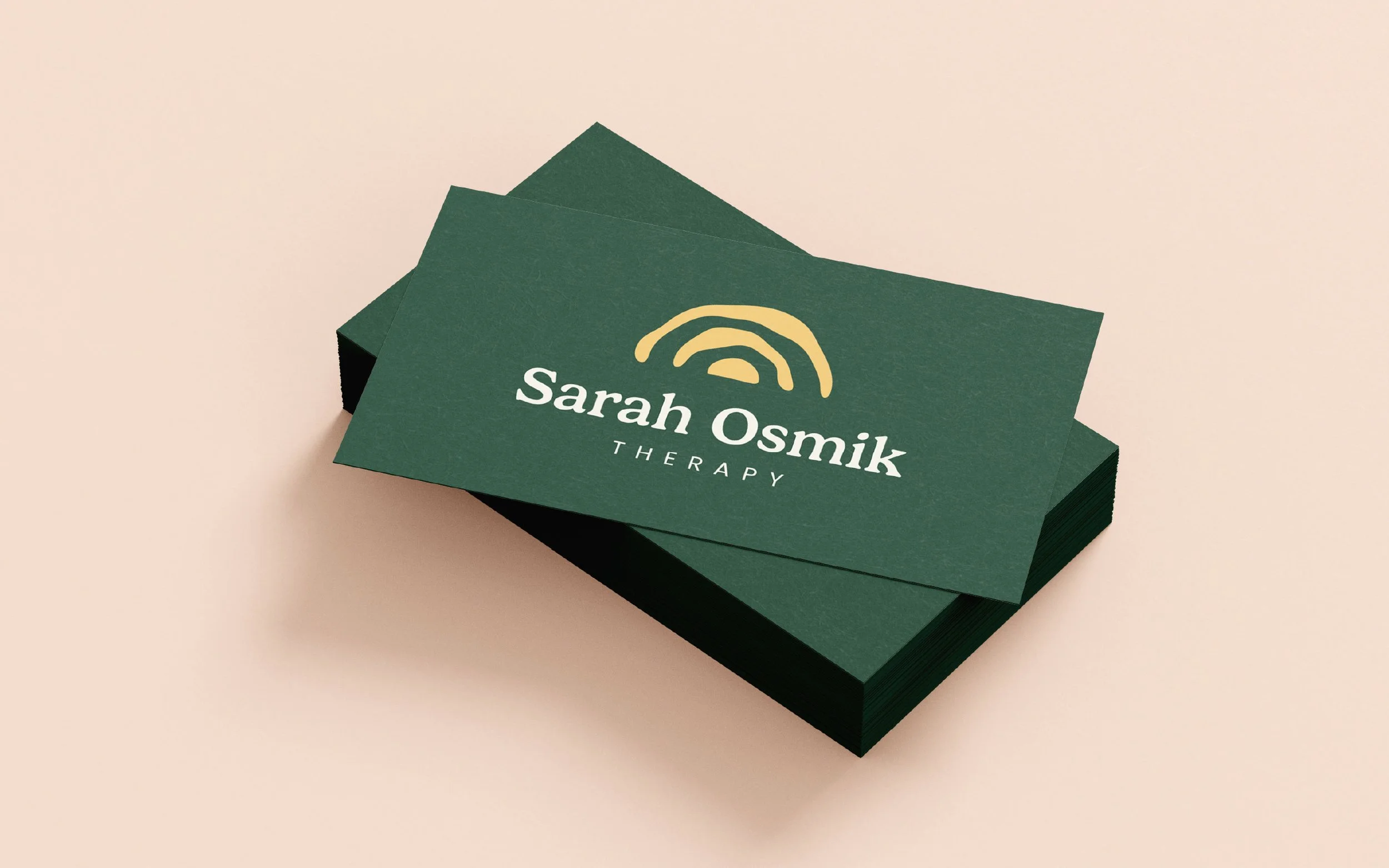
The chosen logo design is clean, typographic, and quietly confident, designed to grow with her. Colour choices were rooted in nature and emotion: soft neutrals, warm embers, gentle greens, and sun-washed pastels to reflect calm, care, and realness. Fonts include New Spirit for headers (elegant but not fussy) and Poppins for body text (modern and friendly).
Design Refinement:
We built a soft, serene visual language enhanced by layered colour blocks, fluid white space, and subtle iconography. The homepage design on Squarespace brought it all together, balancing professionalism with warmth and connection.
The Solution
Logo Design:
A versatile logotype that can flex across future services (e.g. Integrative Counsellor, Relationship Therapist). Clean, modern, and grounded in trust.
Colour Palette:
Forest green for growth, depth, and trust
Sun-warmed yellow for warmth and openness
Soft orange for compassion and energy
Muted sage and blush tones for serenity and ease
Light cream for space and calm
Typography:
New Spirit for elegant, grounded headers
Poppins for accessible, modern body text
Visual Identity:
Layered shapes, soft colour fields, and gentle gradients reflect the integration of the self. A mix of icons and thoughtful copy keep it relatable and human.
The Impact
Relatable & Professional:
The brand feels like Sarah, approachable, emotionally intelligent, and grounded in care.
Versatile & Scalable:
The identity is built to grow with her, into media, couples therapy, and beyond.
Real Connection:
It speaks to modern therapy clients who value openness, clarity, and a therapist who really gets it.
“I worked with Beth on her Brand in a Day package and came away with a full visual identity that truly feels like me and what I offer. Beth made the whole process collaborative, fun, and rooted everything in a deep understanding of my business and goals.”
– Sarah Osmik, Integrative Counsellor


Website: www.sarahosmiktherapy.com
If your business is ready for a brand identity that combines clarity, confidence, and creativity, we’d love to help. Drop me a message or book a Discovery Call to start your brand journey today!